The current craze for all things yellow kicked off last year, when the bright and buzzing Gen-Z Yellow hit the scene, taking over from dusky Millennial Pink. Named after the group of people born between the mid-1990s and early 2000s, Gen-Z Yellow is bold, brash and unapologetically in-your-face. It started on the catwalk but, let’s face it, this isn’t an easy colour for anyone to wear much of. This is probably why it filtered so well into the home – trend-followers wanted a piece of the action without looking like Big Bird.
Now we can see the shade everywhere – it has crept into corporate branding, advertising billboards, website design and more. However, it’s always been a love-it-or-hate-it kind of hue, one that its naysayers are apprehensive about using for fear it will overwhelm their homes with its unabashed brightness. So will the love for yellow last? Well, yes and no. Blindingly bright may not be for everyone, but strains of the shade will certainly be around for a while, as trendspotters predict we’re going to embrace the more grown-up shade of mustard for 2020.
The psychology of yellow
To know why yellow is so popular right now, ask yourself what comes to mind when you think about the shade. Sunshine is the most common association; the light that is essential to our survival, and corresponds to spring and summer time when life is blossoming everywhere. Accordingly, colour psychologists believe yellow has a positive effect on our well-being.
This idea is thought to stem back to a man called Howard Kemp Prossor, who thought, accurately as it turns out, that the right colour scheme could help hospitals treat shell-shocked soldiers. He had Ethel McCaul’s Hospital in London paint its walls a lemon yellow, with blue skies and green floors – reflecting the key hues found in nature.

There's no denying that yellow is never going to be described as a gloomy shade. It's undeniably uplifting, although some suggest that it can come across as aggressive in large doses. After all, there is an element of danger inherent to this bright shade – think poisonous sulphur-coloured tree frogs or the stripes on a honeybee's back.
As with all decisions for your home, the key is to understand the effect colours have on you personally. If you associate mustard with the school uniform you used to hate, then it’s not going to be a relaxing choice for your bedspread. Likewise, if you have fond memories of a favourite pale buttercup dress you once owned, then adding this shade into your decor will work well.
How to use yellow in the home
The main thing to remember is that there are lots of different shades of yellow, so don’t feel like you have to stick exactly to the ones that are trending. As well as Gen-Z and mustard, yellows range from the softest pastel to the brightest neon. These can be combined with almost every other colour family, to create endless palettes.
A few combinations to try including mixing sunshine yellow with navy, white and sand for a summery coastal look. Meanwhile, inserting neon yellow into a black and white palette adds a zing to a monochromatic scheme. Combining mustard with teal, olive and burnt orange gives you a warm, earthy Mediterranean feel, while pairing pineapple yellow with fuchsia, turquoise, emerald and lime creates a tropical vibe.
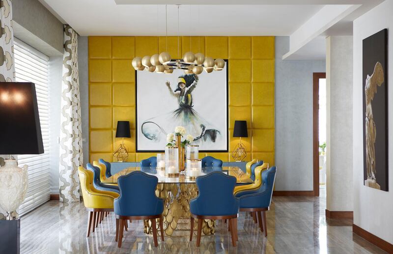
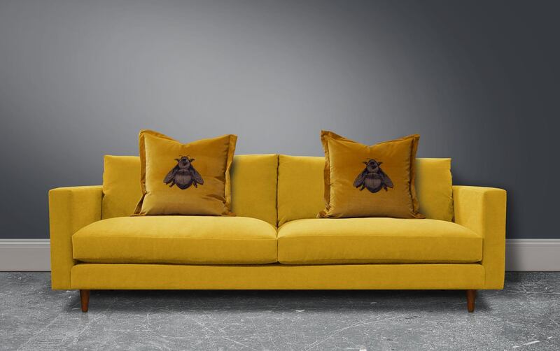
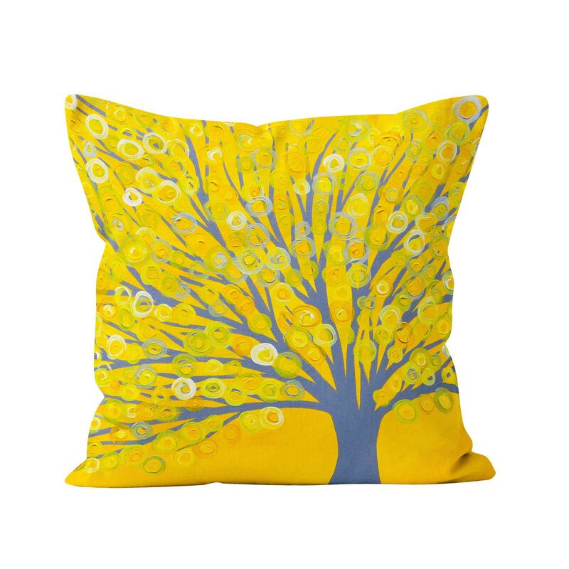
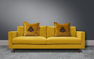
As you can see, there’s no need for yellow to dominate a palette. However, if you do want to make a bold all-yellow statement, there are lots of ways to do that, too. Try an eye-catching accent wall, an oversized rug or even a yellow sofa. These can either be in block shades or with patterns or different textures to make the look a bit more interesting. Other fun areas to transform with the yellow touch are doors, from your kitchen units to your front door.
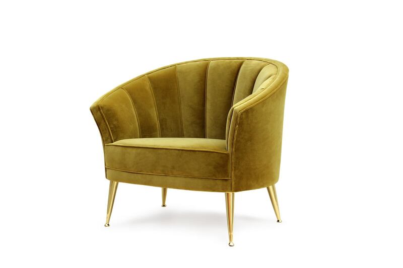
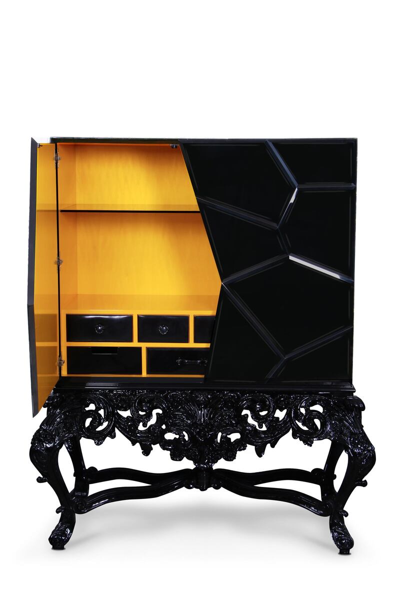
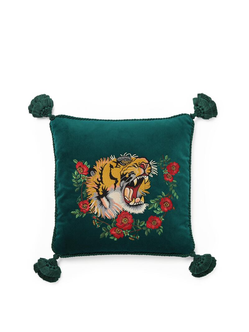
For top trend credentials, choose yellow velvet - ideal for everything from armchairs to scatter cushions - or use the colour in combination with geometric patterns, especially hexagons.
Tips for sceptics
If you’re still apprehensive about yellow, the good news is that you don’t need to go full beehive to enjoy this trending colour. Yellow makes for a great accent, whether as a pop of bright against a more neutral or subdued palette or within a mix of other shades - think floral or botanical prints. By contrasting a warm yellow with cooler shades, you can stop the overall effect from being too overwhelming. Navy, grey and white are all great options.
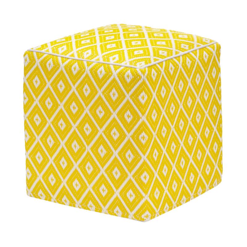
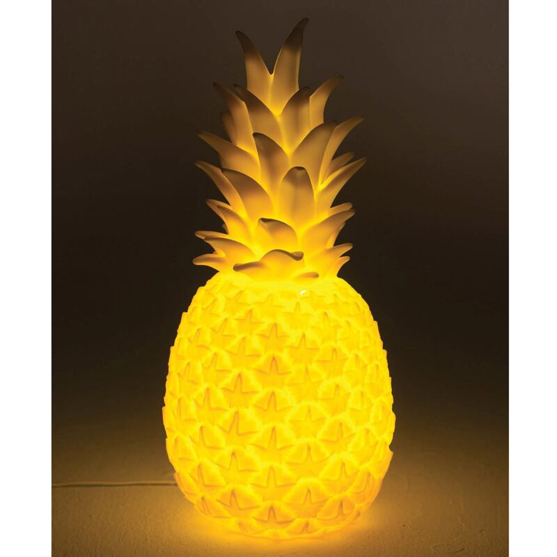
If you want to go subtler still, avoid bigger items and instead look to yellow accessories. Not just the usual suspects, such as vases or artwork, but also quirky light fittings or cutlery to embrace yellow’s inherent playfulness. You can also imbibe the shade in hidden elements, by painting the insides of a drawer, for example.
This colour makes a room feel lighter, so use it in areas that are naturally a bit darker, adding mirrors to amplify the effect. It’s an energetic colour, so think about using it in social spaces; if you’d like to try yellow in a rest area, say the bedroom, choose a softer shade such as lemon sherbet or buttermilk.
Now that you’re aware of the trend, you’ll start to see it everywhere, so pay attention to what resonates with you and use this as a starting point to update your space and, hopefully, introduce an element of cheer to your home.