
Football's a tactical game and some matches can resemble a game of chess as each team plays patiently and waits for the other to make a move.
Barcelona are of the more adventurous variety (who wouldn't be with Lionel Messi in your side) - but they're going down the chess route next season having just unveiled their new home kit.
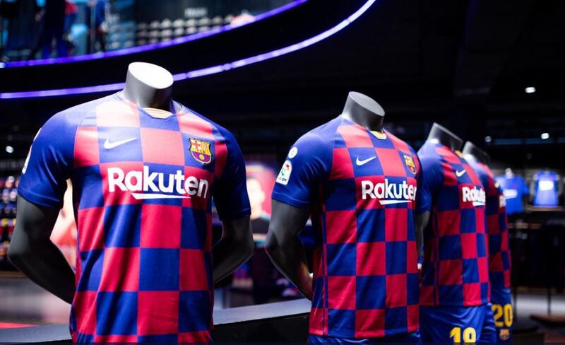
Bucking the traditional striped design much to the annoyance of many of their fans, the Spanish side have gone for a checkered chess-board design for their usual deep red and dark blue colours.
😍 Our captains. Our new kit 🔵🔴#Messi@5sergiob@3gerardpique@SergiRoberto10 pic.twitter.com/bU725DsKQO
— FC Barcelona (@FCBarcelona) June 3, 2019
The club's home kits have featured vertical stripes of different widths since the 1970s, although in 2015-16 they went for a change of look by going horizontal.
The 2019/20 season design by Nike has a strong resemblance to the Croatia kit, and the nation's football federation was quite to point that out, tweeting: "Nice try @FCBarcelona, but you can't beat red-and-white checkers."
🤔🧐😉 Nice try @FCBarcelona, but you can't beat red-and-white checkers 🔴⚪️#Croatia pic.twitter.com/LTYKYpEZ8x
— HNS (@HNS_CFF) June 3, 2019
At least Barcelona's Croatian midfielder Ivan Rakitic should feel at ease in the shirt should he still be at the club when the new season kicks off.
Fans took to social media to voice their surprise at the new design, with it suggested the change has come about due to a lack of creativity on Nike's part.
If this is the real Barca kit then it once again shows a lack of creativity by Nike - identical template to the Croatia world Cup kit. A nice kit but very unoriginal https://t.co/doLTKzqCiH
— Aidan 🐝 (@aidyhogwfc) June 3, 2019
Breaking tradition like the Italian clubs
It isn't just Barcelona who have broken tradition with their kit for next season - a few Italian clubs have been at it too.
Juventus recently shocked its fans by unveiling a half white, half black kit which did away with its traditional black and white stripes. Not only that, they added in a pink stripe down the middle of the shirt as a tribute to the colours of their original home kit.
A choice. An oath. Stand together. BE THE STRIPES. ⚫️⚪️
— JuventusFC (@juventusfcen) May 12, 2019
Introducing our new 19/20 home kit by @adidasfootball – get yours now: https://t.co/lLiqnGe5O1 #ForzaJuve #DareToCreate #BeTheStripes pic.twitter.com/Z2dOaUzc7s
Inter Milan also upset fans when it unveiled its latest blue and black home shirt which included an area of diagonal stripes behind the sponsor's name, making them offset against the vertical stripes against the rest of the jersey.
It is said to take inspiration from the club's 1989-90 kit.
📸 | NEW SHIRT
— Inter 🏆🇮🇹 (@Inter_en) May 22, 2019
The Nerazzurri will wear their new kit during #InterEmpolI! 👕🆕#FCIM pic.twitter.com/al8IzDsagd
“Inter has an incredible home identity, so the challenge was to execute their iconic stripes in a modern and disruptive way, while also respecting their rich tradition," said Pete Hoppins, Nike Football Apparel Senior Design Director.

"We looked back at the iconic diagonal stripes used on the away jersey in 1989 as well as the old club crest and it led us to this very classic design with a break of diagonal stripes across the chest.”
So, is it simply that the shirt designers want to try something different, or is it check mate for the traditional patterns of years gone by?