If clothes make the sportsman, then many of our favourite athletes apparently aspire to careers as harlequins. Or perhaps their employers or sponsors find pleasure and profit in outfitting them in the most ridiculous shirts/kits/uniforms they can imagine.
This must be a hard time for the football or baseball player who grew up dreaming of pulling on the shirt of a big club, only to discover that the shirt they must now wear now looks like something out of a Picasso nightmare.
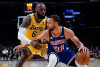
In my day (harrumph), the team shirt ("jersey", we call it in North America) was meant to make for easy identification of a club on the field.
Think "Liverpool FC" and "New York Yankees" and "Boston Celtics" and you have the idea.
Their ensembles were simple and hardly changed over the years or even decades. Primary colours, muted flourishes, a look both dignified and durable.
A supporter could buy a replica shirt and 10 years later it would hardly look dated. Aside, perhaps, from the sauce stains on the front and the name on the back, which honoured a sportsman long since bundled off to a rocking chair.
And now? More and more sports teams seem determined to probe the frontiers of sartorial insanity.
Rare is the professional football club without at least three kits: home, away, and alternate.
Even a traditional football power such as Arsenal indulge in a jarring pastiche of, what, claret and yellow? in their "third" look.
Many baseball teams are sure to wear "throwback" uniforms several times per season, mostly in the hope of luring simple-minded fans into making the purchase of a second shirt.
Some ballclubs go off in unexpected directions, like the San Diego Padres and their "camouflage" look intended as a tribute to the US military but begging the question of whether fans might lose sight of men in uniforms meant to make them invisible. A handful of clubs have been ridiculous from the start, such as, Queens Park Rangers, the English football side.
Grown men cannot wear hoop-patterned shirts, not unless they are French sailors on shore leave.
The most radical proponents of the new wave of garish uniforms are American college football teams.
It was at the University of Oregon, the alma mater of Phil Knight, the chairman of the sports apparel giant Nike, that "traditional" sporting attire all but disappeared.
While conceding the difficulty of a dignified look when your team mascot is the "Fighting Ducks", Oregon went utterly mental.
They soon were wearing a different look in every game they played, each more outlandish than the last.
Lime green, sea green, seasick green … with dashes of mustard yellow, canary yellow, jaundice yellow. It was as if their haberdashers had escaped from a clown school.
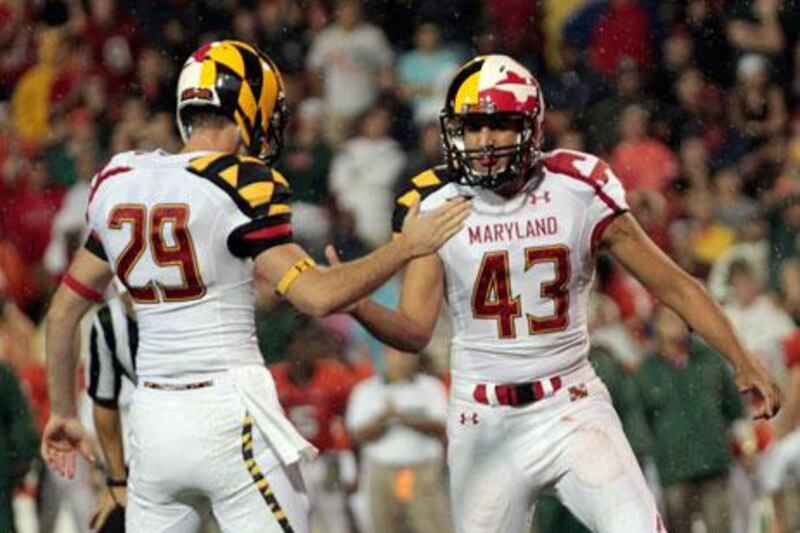
And now comes the University of Maryland which, no coincidence, is the alma mater of another sports apparel boss, one who has outfitted the Terrapins (a sort of sea turtle) with a look that brings to mind an explosion in an ink factory.
Maryland's look is meant to reflect the state flag, a quartered mess of duelling coats of arms that any self-respecting flag-maker would have burned centuries ago.
Paul Lukas, the writer employed by ESPN to follow sports fashion, said Maryland's new look was unworthy of the term "uniform", dismissing them as "costumes".
However, in a dire sign for traditionalists, Maryland's glad rags sparked an eruption among US social media, giving a middling gridiron programme more attention than it has received in decades. In the 24 hours after the new look was unveiled "University of Maryland" was the second most searched term in the US on Google, according to ESPN.
That sort of attention only encourages more madness.
How long will it be before some apparel producer equips a troupe of chimps with paint brushes and palettes and turns them loose to produce Fulham's alternate kit?
It also turns out that Kids These Days not only are OK with David Hockney as the inspiration for their team shirts, they may actually prefer it.
Commenting on the Maryland disaster, a player at the University of Florida said: "You didn't like them? I thought they were nice. I would've worn them."
It does not help that Maryland defeated a more famous school, the University of Miami, while wearing their abominations.
Nor does it advance the cause of traditionalists that Oregon have joined the elite of college football during their time as apparel lab rats.
Perhaps the lesson here is that sportsmen are immune to embarrassment. Given what they are asked to wear, it's a lucky thing.
[ poberjuerge@thenational.ae ]
Follow
The National Sport
on
[ @SprtNationalUAE ]
& Paul Oberjeurge on
[ @PaulOberjuerge ]