


It may only be August, but forecasters are already looking to next year to decide which colours and trends will take off in 2021. The design decisions of next year will inevitably be impacted by life in 2020, and so experts are already predicting that we will seek out hues that offer respite.
While Pantone has yet to declare a shade of the year, American paint manufacturer Sherwin-Williams has released its colour forecast for 2021. This is an insight into the colour choices it believes people will make in the coming year.
The company has shared 40 key shades, which you can see in full in the gallery above. The colours are split into four groups of 10: Sanctuary, Tapestry, Continuum and Encounter.
Sanctuary
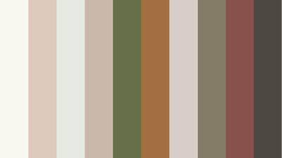
The first set of colours is called Sanctuary, reflecting the peace, stillness and calm that people will be inclined towards after a difficult 2020. Of the collection, Sherwin-Williams says the palette is guided by "the principle of biophilia – bringing nature inside".
These are colours that encourage us to take pause, it says, explaining that respite is "the special role our spaces can embody, helping us slow down and embrace what’s truly important".
The undeniably earthy colours take inspiration from nature and Scandinavian design, and encourage a "warm minimalism".
Encounter
Continuing in the vein of Earth-inspired shades is the Encounter palette.
This set of 10 colours "provides a subtle reminder that beauty often has humble beginnings". The company describes the set as inspired by the "hyperlocal" with a "modern Bohemian" feel.
Continuum
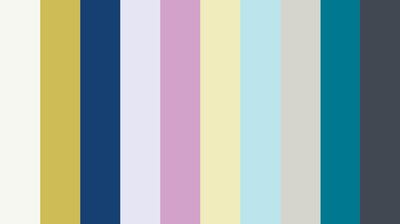
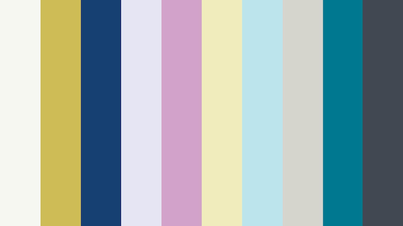
The Continuum set brings vibrancy, an indication that 2021 may not be exclusively about hunkering down and being at one with the Earth.
The company cites this set's influences as a balance between the synthetic and natural, sea and space. It is described as an "engineered environment".
According to Sherwin-Williams: "Mid-century modernists set an exhilarating new standard with sculptural architecture and bright, forward-thinking colours. Technology ties into so much of what we see, but we want it to blend seamlessly into the whites, charcoals and pops of colours in our environment."
Tapestry
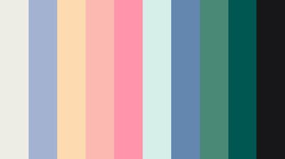
The final set of colours is Tapestry, 10 colours the company says give "permission to play".

"Creative expression – a top influence for the Tapestry palette – is all about personality and authenticity," the company describes.
It is warm palette, with pinks and yellows shining through. "Bringing back joy is an important part of the Tapestry palette," says its creator.
The jewel tones in the collection connect the pursuit of happiness with a desire for the lavish. The 10 colours have been inspired by "security, creative expression, classics revisited and sensory exploration".
"The recent resurgence of maximalism comes in response to minimalism," the company explains, "but with an approach that’s more modern, curated and meaningful."
Demonstrating how the colours will work in domestic spaces, the company shared the following slides on Instagram: