When his grandfather's farm came up for sale, Jurgen Van Durme didn't hesitate. "We just had to wait for permission to build onto the existing building and when we got a 'go' from the municipality, we immediately signed."
Four generations of the Van Durme family had lived under the same roof in the tiny house in the Belgian province of East Flanders. This was irresistible to Jurgen and Elke, an architect and an interior designer respectively, and they just had to live there. Nevertheless, the renovation would prove to be very dramatic. Only the walls and the roof of the original house were kept, the rest was demolished. To integrate the new building into the old, they chose a "box-in-a-box" concept: a small, quaint turn-of-the-century farm house combined with a large, austere modern extension.
"Inside the old house, a new isolated box was built, resting on its own foundations," Jurgen explains. "Only the original outside walls were kept, but without load-bearing function."
The original house was small at seven metres by eight metres. "My great-grandfather lived here with his family in just four rooms," explains Jurgen. During the renovation, the brick stone building was painted in anthracite, which gives a nice contrast with the white plaster of the new block. The hallway is surfaced with the painstakingly relaid mosaic tiles that came from the original house. They were taken up tile by ceramic tile, cleaned and laid again.
"The number of weekends that we worked on this job are not countable any more," says Elke. "And at the end, we seemed to have too few tiles." This problem was solved by mixing the ceramic tiles with a black church stone and a wooden floor, a very attractive combination.
The Moorish-style tiles have a beautiful, bold geometric motif that is echoed throughout the rest of the home: on the wallpaper in the bedroom and lounge, and on the tiles in the bathroom, providing a complementary backdrop to the pieces of mid-century furniture that are dotted throughout the house.
For practical reasons, the kitchen floor is 20 centimetres higher than the hallway. "We wanted to keep a part of the original cellar, and without raising the kitchen floor it would be too low-ceilinged. By putting blue neon lights under the little step, this intervention is visually attractive."
The kitchen has a central island with a rinsing area and a working area of white composite stone, while the transparent Kartell Victoria Ghost chairs by Philippe Starck - now a modern classic - bring visual interest to the kitchen table. The kitchen's original ceiling was taken out to open up the space and make the most of the attractive exposed bricks. Today, the wooden structure of the roof gives a beautiful link to the past. The bare, architectural white steel stairs lead to the upstairs rooms.
The living room floor is oak and the ceiling is painted white with round halogen spot lights from the Planet series of Lirio by Philips. The eating corner of the living space has a neutral wooden table with chairs in red, white and wood. The living room is furnished with a stylish and welcoming handmade corner sofa of cream leather from the Italian brand Max Divani. On the wall is a picture by Marc Lagrange, the well-known Belgian photographer. The retro coffee table stands on a carpet of cow skin. A feature wall is covered with stylish, limited-edition wallpaper by the French brand Elitis.
"Not cheap, but it turns an ordinary wall into a piece of art, which justified the cost of it," says Elke. On the feature wall hangs a wooden moose head made from beech wood, an abstract piece of sculptural wall art by a Belgian company, the perfect trophy head for those with a fondness for animals and who like to keep a clean conscience. In front of the feature wall, low shelves from Ikea function as a television cabinet. "We placed them horizontally instead of vertically and, at first, we saw this as a temporary solution, but having lived with them for a while now, we find they work really well. The living and dining area has high windows, which makes the space even bigger."
"In the summer, we open the windows and the terrace becomes the continuation of the living space," explains Jurgen.
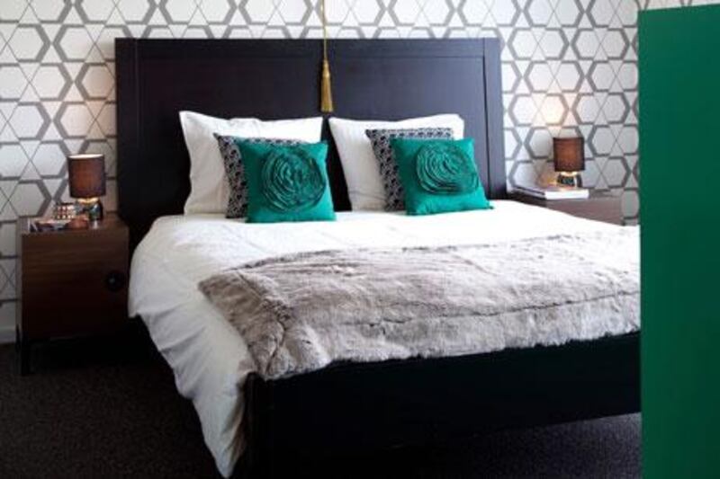
Concrete stairs lead to the master bedroom on the first floor. Jurgen says the floor of the bedroom is stone - practical and anti-allergic. Next to the bed, a big window offers a fantastic view over green fields, like an idyllic painting.
"On the outside, we put a stone frame around this window to emphasise it," says Jurgen. The geometric-patterned wallpaper is from the Belgian company Arte. In the en suite bathroom the bath and the shower are from Ucosan and the taps are from Gröhe. The walls are covered with white mosaic tiles and the bath and shower have stone flooring.
We see the creativity of the residents here where a beautiful, antique cupboard is transformed into bathroom furniture by building a sink into it. The silver mirror above gives a luxurious feel to the room. The bathroom leads onto a small roof terrace that connects to Elke's studio at the other side.
The terrace is sheltered, thanks to the new block attatched to the old house. The decking area uses wood taken from the original roof of the old house - "a temporary solution which has lasted until now," explains Jurgen.
Asked if the house became what they had in mind, he says: "We wanted to preserve this house, because of the emotional value and wanted to enlarge it and put in modern comfort. By building a box into the original structure, we suceeded. And also the contrast is very big - the old house in painted brick and the new wing in white plaster - old and new are combined in a harmonious way."