Robert Reid on choosing colour
Paint is the fastest way to transform or update a room, and while the colour choice is essentially down to you, there are factors to consider before you decide.
1 Understanding the qualities of colour and the effects they have on how you experience a space are the most important criteria. The amount, type and quality of light determines our perception of a colour, and the composition with other materials in a room can have a dramatic impact on the overall look.
2 Consider the time of day the room is primarily used. Natural daylight is not important for a room used in the evenings for relaxing and entertaining, but overhead lighting and lamps are critical.
3 Think about the colours you are comfortable with: look at your clothes, car, furniture and fabrics. Decide on a palette that feels right to you.
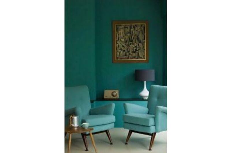
4 The adage that "light colours are for low-light rooms" can be limiting without good reason. If your room has little natural daylight, don't be afraid to use darker shades. Charcoal grey walls in a north-facing living area with a single window can be very striking.
5 Lighter versionsof yellows, blues and greens can be used to create elegant spaces that appear more formal, while casual, warmer colours, including browns and those mixed with yellow, provide a neutral background.
6 If you want to create a dramatic space, bold and pure colours are the way to go. A cosy and relaxing space will typically have warmer and more earthy colour tones.
7 While different parts of the world tend to favour different hues, unrelated regions tend to demonstrate interesting similarities. With monochromatic landscapes through much of the year, people in equatorial, arid desert areas and those in northern, snow-covered regions are drawn to colourful decor as a contrast to the starkness outside.
8 Aside from an overall colour choice, paint can be used to create feature walls. A bold colour can make a dramatic impact, while a different tone, shade or tint of it can be used for contrast. Choose a wall on which you can group artwork or decorative items, or in front of which you can make a statement with one or two interesting furniture pieces.
9 Where possible,avoid having a feature wall colour end at an outside corner, which creates an awkward termination point. If the ideal wall to highlight turns a corner, continue the paint until it ends at an inside transition.
10 If you're working with a bold, bright colour, maximise its impact by limiting it to one area and balancing it with neutral tones such as white and grey. Don't be afraid to introduce more colour with soft furnishings and accessories.
11 Before making your finalcolour choice, paint a sample colour onto a piece of paper or card and place it on the wall. Notice how the colour changes at different times of the day. This is particularly useful when you are decorating a room that you will only use at certain times of day. For instance, if you are decorating a dining room that is mostly used in the evening, check the colours in evening light to ensure you get your desired look.
12 Monochromatic schemes are particularly good for irregularly shaped rooms since they help to iron out any visual faults.
13 Environmentally friendly paints have lower levels of chemicals including heavy metals and VOCs (volatile organic compounds), which give off fumes even after paint has dried. Eco-friendly paints are usually made of natural materials but make sure to read the labels because standards for "eco" can vary.
A recent arrival on to the UAE market is the specialist American brand Mythic, a non-toxic, low-odour paint that contains no toxic gasses. It's available in a range of colours and finishes but currently only stocked at Ace in Dubai Festival City.
Pallavi Dean on how to use this year's big colour, Tangerine Tango
14 If you are going to make a bold statement in your home, use Pantone's 2012 colour of the year: Tangerine Tango.
Loving this tone is one thing; making it work in your living room is a whole different matter. Commit to the colour and build a monochromatic palette of upholstery and accessories with peaches, mustards, dull pinks and reds.
For a good example of how well this works, check out the fashion designer Elie Tahari's Spring/Summer 2012 collection. His refined palette of tangerine combined with sun-bleached yellows and warm terracotta tones is striking. You can apply these lessons in your home.
15 Tangerine is a strong hue and can dominate the look and feel of your room. If you aren't 100 per cent in love with it, start small and coat just one key wall. Balance this dash of colour with a muted palette of khaki or grey on the remaining walls, upholstery and floors. To give the palette a little twist, introduce another complementary colour: a bold blue chair or turquoise cushions on your couch will further bring out the vibrance in the tangerine.
Rin Simpson on preparation and application
16 When it comes time to purchase paint, remember you are making an investment. Cheap paint is a false economy. It might seem like you're saving money buying the value stuff, but you'll end up needing a larger quantity to get a decent finish, and the watery consistency means it's harder to work with. Plus it drips everywhere.
17 Try to buy all the paint you'll need for a room in one go, especially if you're getting the colour mixed. This will help maintain consistency. To calculate, simply work out the area of each wall (width multiplied by height) and add the totals. There are also a number of online calculators available.
18 You'll also want to invest in good supplies. In general, the cheapest foam rollers are not worth buying, while the rule of thumb with other materials is that the shorter the pile, the smoother the finish.
19 If you're buying a refill roller remember they come in different sizes. Make sure it will fit the handle. And pay attention to the weight. Painting a room with a heavy handle can take its toll on your arms.
20 When choosing a brush, consider what the filaments, or bristles, are made of, whether they're "flagged" (ie split, which helps them hold paint) and how absorbent they are. A tapered polyester filament brush is a good all-rounder. If in doubt, buy the most expensive brush you can afford.
21 If the wall has cracks or dents, you will also need filler and sandpaper. Rubbing the wall with sugar soap will ensure there is no grease or dust, which would stop paint adhering evenly.
22 Primers are used to prepare a surface, and help adhere paint to raw surfaces. Undercoats are a type of primer that serve to even out imperfections and give density to the finish when used with an emulsion topcoat.
If you're painting a new, raw plaster wall, prime it with a diluted water-based paint, which will allow for the extra absorption.
23 Make sure not to overload your brush or roller, since this will cause drips. Try to cut in an area and then fill it before moving on to the next area. This will help you maintain an even finish.
24 "Cutting in" is the technical term for painting around edges, and it is a job that needs some dexterity.
Use a small brush and go slowly, holding the brush at an angle so the filaments fan out to create a smooth line. For a really neat edge you can use a medium strength masking tape to create straight lines. It's worth spending a bit extra on a professional-standard brand. Otherwise you run the risk of unintentionally removing paint from ceilings or other adjacent walls.
25 When you've finished painting, be sure to clean your brushes and rollers, kettles and trays thoroughly, using a suitable solvent if you've been working with gloss. If you're planning to continue working the next day, you can wrap unwashed brushes and roller heads in cling film, which will keep the paint wet and ready to use.
Trends for 2012
Calm
Soft, safe colours. Colour psychologists say this is to do with international political and economic uncertainty, and when things begin to look up, brighter, more vibrant colours will come on the scene.
Neutral
In the 1990s, "neutral" meant beiges and tans, but today there is a new neutral palette influenced by Scandinavian style. Blues and soft greys, chalky whites, charcoal and stone shades are all very on trend for 2012.
Palettes
While colours remain fairly muted, designers are adding a kick to colour schemes by combining unusual shades such as mauve, teal and mustard or pistachio, grape and raspberry to create a little bit of theatre and keep things interesting.
Pastels
On a more frivolous note, our obsession with nostalgia, the 1950s housewife, and crafts and home cooking has brought pastel colours to the fore once again. For 2012 they're a little more zingy and vibrant, combining well with touches of neon brights.
Earthy
Traditionally, heavy earth tones have been used to create warmth. Today the comforting palette has been lightened just a touch, with colours such as umber, bronze and olive mixing with paler shades such as sand, driftwood and stone.