Graphic design, photography, fine art – what have they got to do with home interiors? Well, quite a lot actually. Because although they are fairly different fields, at heart they are all linked with design – and there are certain principles that can be applied across them all. Once you know these, you'll be able to use them all over the place, including in your own home. Here are some fundamental ones to keep in mind, which are simple to implement but hugely effective in giving your overall look a professional edge. Your guests may not be able to say exactly what it is you've done, but they'll definitely notice that something has changed.
The rule of thirds
This theory dates all the way back to the 18th century, and is popularly used in fields such as photography and art. It is based on the simple idea that an image can be divided into thirds vertically and horizontally (such that it produces nine blocks), and that the main points of interest should be placed along those lines rather than in the centre of the image to create the most effective result.
Put it into practice: The rule of thirds can be used in all sorts of ways. For example, you might hang a painting a third of the way down your wall from the ceiling, and / or a third of the way across from the edge of the wall. But whenever you see a space, try mentally dividing it into nine blocks and you'll notice how placing accessories along the lines makes it look that much better.
The golden ratio
The golden ratio is said to account for beauty in all its forms. Simply put, it is a ratio of 1:1.618, which is based on a shell-like spiral structure, an idea dating back about 2,500 years to ancient Greece. Without going too deep into the mathematics, the ratio has been roughly interpreted in design as the 60/30/10 rule. This can help create balance and beauty by using the correct combinations of scale and proportion.
Put it into practice: There are many ways in which you can apply the 60/30/10 rule at home. For example, when creating a colour scheme, try to use one colour on 60 per cent of the space, another on 30 per cent and a third on 10 per cent. Equally, aim to fill about 60 per cent of your room with furniture so that it doesn't feel too empty or overcrowded.
_____________________
Read more:
How to choose the three most important buys for your home
Tips for how to think like an interior designer
Home decor: a look at the key design trends making their way in 2018
_____________________
Colour theory
When it comes to colour, there's a lot more to creating the perfect palette than the right ratio. In theory, pretty much any combination of colours can work. Just think about how wildly nature mixes different shades. But when it comes to creating appealing artwork, eye-catching graphics or a welcoming home, there are guidelines that will help ensure a harmonious result. One important principle is that complementary colours – those that are located on opposite sides of the colour wheel – will work well together, but will create a look with a lot of energy because they are completely different. For a more restful look, analogous colours are more appropriate – these are hues that sit next to each other on the colour wheel.
Another factor that influences how much energy a colour palette has is the number of colours it contains. A monochromatic palette, which uses tints and shades of just one hue, will create a much more calm feel than one which uses lots of different colours. Likewise, the stronger the colours, the more vibrancy they add to a design.
Finally, remember the rules around warm and cool colours. At a basic level, we can say that reds are warm and blues are cool, but in fact there are some cooler reds such as raspberry and magenta, and warmer blues such as turquoise and sky blue. While neither colour is actually going to affect the temperature of a space, it will affect the way you perceive it.
Put it into practice: Decide what you're trying to achieve with your look before you start picking colours. Are you after a vibrant party atmosphere for your living room? A restful and relaxing space in which to sleep? Understanding even the basics of colour theory will help you create the right atmosphere in your home.
The rule of odds
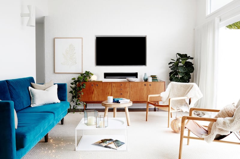
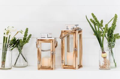
While even numbers create symmetry and balance, when it comes to creating great design, it is actually odd numbers that bring the interest and movement that so attracts us. The eye isn’t able to separate pairs as easily within an uneven group, helping us to see the harmonious whole rather than disparate individual elements.
Put it into practice: Wherever you have a collection in your home – whether that's plants on a shelf, candles on your mantlepiece, or paintings hanging on the wall – make sure you group the objects in uneven numbers. If you can add some variety in terms of sizes (see the golden ratio for proportions) then it will look much better.
The principle of repetition
Repetition is an important tool used by designers of all types. Sometimes it is very obvious and formal, for example in patterns, but it doesn’t always have to be so. Gradation – where change occurs gradually across a space, like it does with the ombré effect – is a form of repetition, as is radiation, where repetitions spread out from a central point. Likewise, you can use a more ad hoc form of repetition by mirroring or echoing certain shapes, tones, textures and so on in different elements of a design to create a sense of whole.
Put it into practice: Don't feel like you need to have every fabric and wallpaper in a matching pattern to create a consistent look – this would be overwhelming. But if you have a feature wallpapered with a bold hexagonal print, for example, then a couple of hexagonal scatter cushions or a hexagonal clock on the wall would complement that by using repetition. Equally, if you've got a piece of furniture made from rustic wood, then a picture frame in a similar texture of wood would be a good addition in a different part of the room.
By understanding some of the general design rules that underpin interior styling, you’ll start to see why some things work and others just don’t. Then all you need to do is make a few small changes, and you’ll have the professional touch you’ve been aspiring to achieve.