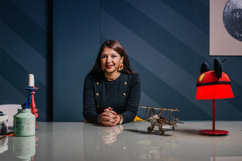
If you want to increase energy flow and productivity, pick a red, orange or yellow hue for the office decor – but make sure they don’t overwhelm, says the interior designer Antara Roy.
Conversely, blues and greens stimulate the mind and “maintain a calm atmosphere”, she says.
“Wall colours you choose for an office space can have a dramatic effect on you, your clients and colleagues,” says Ms Roy, who runs her own Dubai-based business, AR Designs.
“We’re affected in ways we are perhaps not even aware of. At most times, these effects are subliminal and instinctive.”
Laura Guido-Clark, who has run her own US-based design agency for almost 14 years, acts as the creative director of materials innovation for the furnishings company Herman Miller. She helped them introduce new, more muted greys – carbon and mineral – to the latest incarnation of their classic Aeron chair.
“The workplace has many intentions, some vital, collaborative and active, others for pensive thought. Colour needs to support it all,” says Ms Guido-Clark.
She points out that colours do not have to be “mono” and can act as a “visual reprieve or relief” – it’s about the “intensity or saturation of colour”.
“We often forget the material aspect but it is your first impression,” she adds. “Taking in an environment, it’s saying something to you before you can even take it in and talk about it – the culture of the entire office. It’s about the human experience.”
Mei Al Hakim, an interior designer at the UAE furniture stores IDdesign and Chattels & More, advises businesses to “break away” from conventional beiges and browns to bring creative thinking and a “new soul to the space”.
She recommends taking inspiration from your brand identity. Off-white with a tinge of blue and red is much better for functional work, she says, than “simple monotones”.
But Ms Roy says her “go to” colours are creams, beiges and greys, combined with “accents of gold or silver”. Some may say they are safe or staid, she agrees, “but typically you can’t go wrong with neutrals”.
Ultimately there’s no right or wrong colour, she says – “you just have to use it in the right way for your space”.
q&a tones that set the mood
Suzanne Locke expands on the effect office design can have on your company’s productivity levels:
What about materials and textiles?
Laura Guido-Clark stresses the importance of choosing “warmer” materials and textiles for the office – wood, for instance. Mei Al Hakim suggests an “out of the ordinary pick” such as ash wood, concrete, acrylic or marble stone for a “zing”. She also suggests a textured wall to look “appealing yet subtle”.
What’s the most relaxing colour?
Baker Miller Pink was a flesh-coloured shade used in jails as an experiment in the late 1970s and ‘80s by Alexander Schauss of the American Instittute of Biosocial Research, who claimed 15 minutes’ exposure calmed inmates. The shade was officially named in tribute to the two directors who allowed the experiments to take place. Model Kendall Jenner painted a wall in her Los Angeles living room in the shade last year because she said it was “scientifically proven to calm you”.
What are the most popular colours for homes?
According to paint firm Dulux, the colour to pick this year is Denim Drift, a “timeless and versatile grey-blue”. Last year it was the creamy-bronze shade of Cherished Gold. Paint colour trends, they say, go in three to five-year cycles, so they always try to pick something with longevity. As its colour for 2017, colour company Pantone picked Greenery, a “fresh and zesty yellow-green shade that evokes the first days of spring.
business@thenational.ae
Follow The National's Business section on Twitter


