
Designing a logo for a new company is never easy but branding a nation is even harder.
Which is why the government's plan to create a UAE national logo is creating huge debate among the nation's most prominent design experts because like anything in life, whether or not you like a design is entirely subjective.
The public have been asked to pick the final design from five logo finalists uploaded onto the official website of Sheikh Mohammed Bin Rashid Al Maktoum, Vice President and Prime Minister of the UAE and Ruler of Dubai.
Visitors can view the logos, which have variations in both Arabic and English, read a short description of the concept behind them and then vote for their favourite. The most popular design will then be used as a logo to promote the interests of the UAE both here and overseas to project a unified UAE identity.
So which design will achieve that mission the best?
For Craig Falconer, the creative partner of North 55, a Dubai-based design agency that includes branding in its list of specialisms, all of the designs offer something interesting but he feels they all need refinement.
However, two designs stand out the most: The Fabric of Society, which takes its inspiration from the fabrics and patterns created by Emirati artists through the ages, and Vivid Tapestry, a colourful creation that uses traditional Kulfi calligraphy to reflect the nation's culture and heritage.
"If it was a case of taking one logo and running with it, there's a nice rationale behind Fabric of Society and that's important because when you build this brand it's not just about putting logos on things, it needs a strong story behind it so that the media and the public can embrace it," said Mr Falconer.
"However, if there was time to work with the concept developers then I think there is more mileage in Vivid Tapestry. It has more depth, uniqueness and more culture."
While Pallavi Dean, a visiting professor in Interior Design at America University of Sharjah and the Design Director of Pallavi Dean Interiors, also chooses Vivid Tapestry as the winner, she and Mr Falconer agree that the design needs to be tweaked to make it more legible.
"I love it because it references back to the Kulfi script and the idea of Arabic calligraphy and all the colours and patterns are so representative of the diversity and culture of where the UAE started off and where it is now," Dean says. "But it's difficult to decipher and although using calligraphy in design is very trendy now, it needs to be more readable especially if this is the nation's identity and is going to be out there internationally."
Mr Falconer believes the Vivid Tapestry concept is less effective when it is actually applied to an advertising campaign, something highlighted by the website's mock photos of how the logos might look in practice, adding that there is a danger in the judging process if the public only judge the logos as standalone designs.
"You have to look at them in application as some of them work really well in application but don't work as well as a standalone on a piece of white paper."
Mr Falconer also says he is also surprised by the government decision to open the selection process to the public rather than taking advice from experts.
"Professionals have education and training from a design degree and then some professional experience on top of that, that adds value to a project like this. While public perception goes a long way, whether that's a fair representation of who the logo is aimed at is a different matter. I don't think public perception will reach all the target audiences so, for example, tourist professionals or foreign investment professionals might not view the logos in the same way as if they had their public head on."
Mr Falconer and Ms Dean also agree that the five logos do not reflect enough of the nation's history traditions and culture.
"I've lived here for 30 years and when I think about the UAE, I think about the desert and all the sand-coloured hues. I understand why most of the logos use the colours of the flag, but they are missing the character of the desert and the UAE should not forget its roots," Ms Dean says.
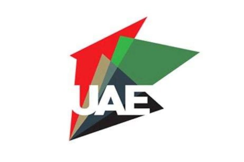
Interestingly both Mr Falconer and Ms Dean pick All Encompassing as their least favourite logo - a swirling design that once again uses the national flag's colours - agreeing that it looks too corporate or as though it represents a petroleum company.
However, artist Ness Ashford, a designer for Peas In A Pod, a company that designs local pieces of art using a multicultural feel to reflect all aspects of the UAE, picks this design as her favourite.
"Fabric of Society and 'You' can be anything look dated and bearing in mind the concept is to represent the UAE with its diversity, they weren't representative of that. For me you need to have the UAE written in a nice simple font which All Encompassing has and the swirling colours made it feel 'all encompassing' of the UAE. It's a very multicultural place and yet it all comes together to form a country that's so diverse and one that works. It's like a puzzle that all comes together."
With voting set to begin this Sunday and finishing on July 18, any of the five could win.
But one thing the three do agree on is the nation's need for a logo, though Mr Falconer says it needs to be approached in the right way.
"There are a lot of emirate and event logos in existence already so there needs to be some unity and all the emirates have to come together and endorse this at quite a high level. In principle, it is a great idea but in practice that has to be thrashed out on a more fundamental level looking at what brands exist, what can go and what this will take the place of?"
arayer@thenational.ae
To view and vote on the logos visit the official website