
Graphics, geometry and mixed metals
It’s time to go back to geometry class – circles, squares and triangles are making a comeback. Look at furniture, rug and lighting design: the evidence is everywhere. Overlaying bold shapes and forms to create three-dimensional, graphic designs is a big trend, as the lines between furniture, interior and graphic design are blurred.
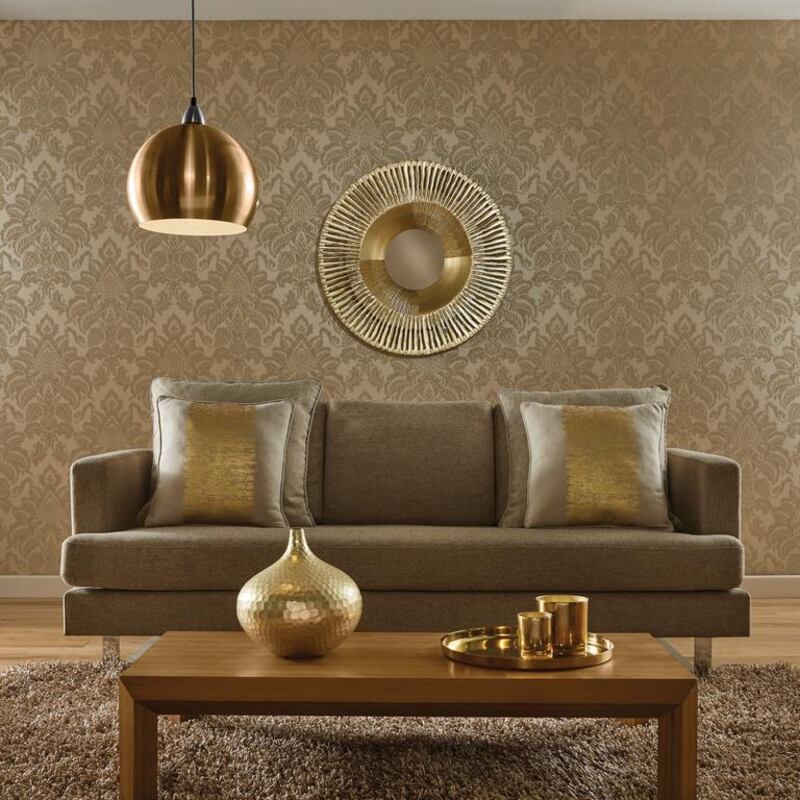
In 2017, we also have licence to mix our metals. Being a purist, my designs generally employ one metal accent throughout a space: either gold or copper or silver. But things just got glitzier. In our coming projects we are experimenting with contrast – cold metals such as steel and silver, sitting alongside warm coppers and rose golds. We’re also mixing finishes, so polished surfaces are sitting pretty next to hammered and brushed matt textures and rusty patinas.
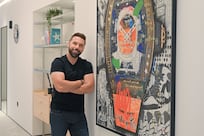
Pallavi Dean, founder, Pallavi Dean Interiors
Modern Middle Eastern
It is very possible to combine traditional Arabesque designs with more contemporary elements, and this is exactly what we are trying to achieve through our design house, because a lot more customers are asking for it. They want the comfort and practicality of modern pieces, matched with the authenticity and luxury of old pieces. You can use a glass dining table coupled with authentic Arabesque dining chairs, for example.
Don’t be shy with pattern and colour when it comes to Arabic pieces. It’s always about good proportions: good design and size, and balance between colours. If your message is minimalism, somehow influenced by orientalism, you can use two or three elements across the whole house – statement pieces such as a large mirror, a chest of drawers or architectural elements like doors.
Omar Hossama, creative director, Etqaan
Coloured by travel
A new year is a time for reflection, but also a time when you embrace new energy. Jotun’s 2017 colour palette reflects the various elements of an individual’s lifestyle, with an emphasis on travel.
It focuses on creating a worldly feel centred on three key styles: Nordic Living, Continental Living and Urban Living. Key hues include deep red, brown and mustard. Elegant pinks continue to take centre stage, complemented by warm greens and neutrals. Perennial favourites are retained, with lighter greys and sky-tint blues, as well as gold tints.
Choosing a new colour from the plethora of options can be tricky. The secret is to choose a hue that inspires safety and comfort, while also being brave enough to create a personalised style inspired by your travels. The food we eat, the books we read and the music we listen to come from all corners of the world, and should inspire our choices in our homes.
Lisbeth Larsen, global colour and creative director, Jotun
sdenman@thenational.ae