In the past couple of years, grey has taken over from beige as the ultimate neutral, and it’s not hard to see why. The main advantage is that it’s eminently flexible, working well in just about any interior-design scheme, with any accent colour, from mustard to fuchsia. It can be used to create looks as varied as industrial, shabby chic and mid-century retro.
But there’s a risk that comes with using a colour that has long been associated with gloomy moods, dull rainy days and a general sense of pessimism and colourlessness. If you’re not careful, a grey colour scheme can leave you feeling a bit flat – but get it right, and there’s a world of style possibilities at your fingertips.
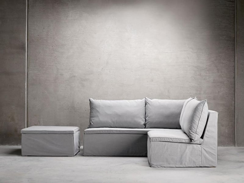
The first thing to remember is that where green has olive, lime and sage, and blue has cobalt, cerulean and sapphire, grey can retort with slate, battleship and platinum. Yes, there are as many shades of grey as there are any other colour, and each one will help you create a different effect.
Think of a hard, flat, dark grey versus a soft dove with a bit of a sheen. The former would look great as part of an industrial-style decor, for example, while the latter could work well in an elegant bedroom.
Warm, cool, dark, light
Unlike beige, which is usually quite a warm colour, grey can be warm or cool, and this is one of the key choices you will need to make when deciding how to use it in your home. Cooler greys have undertones of blue, purple and pink, while warmer ones are more green or yellowy at their base. Trying to combine the two will generally jar, so stick to one or the other, unless you want to create a discordant effect.
Looking at undertones will also help you choose your accent colour(s). Mixing a pink-based grey with a mustard accent, or a yellowy grey with mint, will have a negative effect on both. Instead, make sure the undertones of your grey(s) and the other colours in the room blend – mauve grey with royal purple, for example, or sage grey with cream – and you will create a harmonious look that’s pleasing to the eye.
However, when it comes to the tone (in other words, the lightness or darkness), using a number of different levels will add texture and depth to your look. For example, you might decide on soft cloud-grey walls, a deeper smoke-grey sofa, and accessories in polished steel, aluminium or antiqued silver. The combination will be far more pleasing on the eye than a series of items that all match exactly.
Texture and shine
Speaking of metallics, using reflective surfaces is a great way to add interest to your look, and stop the grey theme from becoming dull. Mirrored furniture, sequinned fabrics and shiny metal fittings all look great against chalky grey walls and velvety soft furnishings. Polished stone, marble and granite in various shades of grey are excellent choices for adding a subtle sheen, too.
Texture will also add depth and interest, and stop the overall effect from becoming too clinical. One simple way to bring texture into your scheme is to use natural materials such as slate, rough stone and even sun-bleached wood. But don’t forget the softer textures, too, such as nubby or velvety fabrics and knitted items, which will add a sense of comfort and cosiness to your space.
Accents and contrasts
Let’s go back to colour for a moment. No matter how many shades you layer together, it’s unlikely you will end up using grey on its own in your home. So what should you combine it with? The answer is pretty much anything at all. Because of the undertones already mentioned, grey really is a versatile and easy to match colour.
Being a mix of black and white, grey works really well with monochrome, especially if you keep the blacks and whites soft and natural. For example, a combination of stone (grey), charcoal (black) and chalk (white) will create an incredibly restful look. By contrast, hard, shiny versions of those same colours – chrome, ebony and porcelain, for example – can combine to form a very sophisticated, modern effect.
Another way to create a calm look is to pull out the base colour from your grey and use it at the same saturation level as the grey itself. A soft ashy grey and a dusky rose pink or lavender, for example, would look great as part of a restful bedroom scheme.
On the other hand, grey makes an excellent backdrop for pops of brighter colour, such as coral, cerise and lime. It can also reign in these vibrant shades so they don’t become too overwhelming, acting as a neutral anchor point.
Top tips for key looks
Having got a handle on the basics of making grey work in your home, here are a few tips for incorporating this on-trend shade into a number of popular styles.
Industrial: This utilitarian theme lends itself to metallics and work-worn tones, with exposed pipework and aged woods being the order of the day. This is definitely one for strong, cool greys, but you don't want the effect to be too dark and gloomy, so combine with lots of white, and ensure there's plenty of natural lighting in the room.
Mid-century: Cool, pale greys work wonderfully with the classic mid-century colour palettes, whether you prefer the pastels of the 1950s, the psychedelic shades of the 60s, or the earthy oranges and yellows of the 70s. A classic mid-century wood-framed sofa in a felted grey fabric would make an excellent starting point, and a great backdrop for some eye-catching cushions.
Shabby chic: This stylised vintage look naturally lends itself to the softness of warm, pale grey tones, which blend with the mellow whites, antique creams and tarnished metallics commonly associated with it. Avoid harsh blocks of grey with this look; instead, go for mixed-shade patterns and accessories so as not to overwhelm it.
Bachelor pad: Warm, dark greys – such as pewter – make a strong statement and can work extremely well in a masculine space such as a bachelor pad. The more you use, the more dramatic the look, especially if there's limited natural light in the room. For a really welcoming feel, combine your grey with plenty of white and accents of natural browns and tans to add warmth – wood and unstained leathers are a great choice.
homes@thenational.ae