A documentary following teams of Dutch and Arab type designers, graphic designers, architects and product designers working to create five new Arabic fonts that match existing Latin fonts will be screened in Dubai on Saturday.
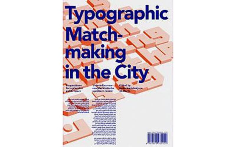
Typographic Matchmaking in the City was a design project commissioned by the Khatt Foundation, a Netherlands-based design research centre, in 2008. The three-year project saw five teams of designers taking inspiration from location in Dubai, Sharjah, Amsterdam, Pingjum and Doha to create fonts that merge the Latin and Arabic script. The project was documented by Dutch short films maker Jan de Bruin.
“The film is a documentation of the project we concluded in 2010,” says Huda Smitshuijzen AbiFares, founding creative director of the Khatt Foundation.
“We had an interdisciplinary theme in mind and wanted to make dual-script font families that could be applied in public spaces. The challenge was to make monumental scripts.”
“Dubai and Sharjah became our case studies because of the rapid urbanisation of these cities. And then we look at places like Amsterdam, which were developed a long time ago and haven’t changed that much for a variety.”
“What we saw on the streets were fonts that are meant for print. They are legible, but not very inspiring or new. So we tried to react to that in a way. We wanted to merge creativity and legibility with a new approach.”
She says using such innovative fonts in urban spaces could, in turn, promote creativity among people and start a conversation on different cultures and a dialogue through design.
AbiFares says the major challenge for the teams was to come together and agree on a concept.
“Some designs force two scripts in two dimension and there are scripts that dance together. The biggest challenge was to work from a distance and manage expectations,” she says.
The teams spent a week in Dubai and Sharjah, visiting Art Dubai, Al Bastakiya area, souqs and the creek.
“One team was inspired by the landscape, water coming int the land around the creek, the skyscrapers and the amount of repetition.”
Another team looked at the heritage and found the kufic script as a starting point.
“The Kufam font, for example, was inspired by scripted used on monumental architecture. It is a new form of kufi script and can be used as an art decor font. This is one of the legible fonts from this project.”
The Kufam typeface was created by Dutch type designer Artur Schman and Wael Morcos from Lebanon. The Arabic is inspired by early, seventh century, inscriptions and the Latin was taken from Dutch urban lettering of the 1920s.
The project was also followed by a book by the foundation which has comments by different designers about lettering public spaces and the sketches and themes that were a result of the research.
“The idea is to trigger possibilities. In the book, we have tried to show different possible applications of the font in public space for art,” says AbiFares.
“Like poetic text that can move on modular screens. Another one with perforated dotted lines that can be used on benches or walls of a souq.”
Typographic Matchmaking in the City will be screened at Creekside, a recently opened cultural space along the Dubai Creek, at 7.30pm on Saturday. For more information, visit creeksidedubai.me. To know more about the Khatt Foundation, visit khtt.net


