Thanks to the internet, we're reading more words a day than ever before. We wade through emails, instant messages and social media posts, many of which link us to further screens of text for us to scan, absorb and process. But how good are we at reading all this? The statistics may prove that we're reading voraciously, but how much of it is sinking in?
Back in 2009, neuroscience professor Dr Bill Klemm voiced his concern that the internet might be contributing to a fall in reading proficiency, and in particular how elements of web design – bullet points, sidebars and graphics – caused us to skim read, thus “creating bad habits for in-depth reading”. Dr Janneke Blijlevens, senior lecturer at RMIT University in Melbourne, believes that this is still the case. “With information everywhere, we tend to read really quickly,” she says. “We don’t work to engage with the material, and if we don’t properly engage with it then we won’t remember it.”
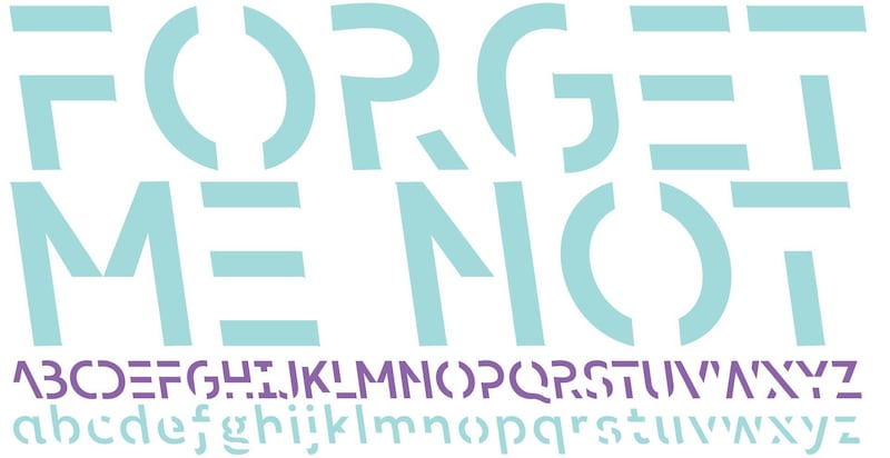
A team led by Blijlevens embarked on a project to improve engagement and memory by using an unusual typeface. The university's behavioural business lab and the design school produced an angular font with small sections of each letter missing. They named it Sans Forgetica.
The principle behind the font is simple: by making the text slightly harder to read, readers have to take a longer time to process the words. A study of 400 RMIT students showed an uptick in memory retention, with a 7 per cent improvement over text written in a standard Arial font. Although Sans Forgetica was designed to help students in revising, it’s possible that it could help with learning languages, in remembering speeches and much else besides.
_____________________________
Read more:
'River of black gold': Why printers have us all bleeding red ink
Why do people love unboxing videos?
How face filters on phone apps are leading teens to get plastic surgery
_____________________________
Reading seems to be one of those activities where slow and steady wins the race. Speed reading is often touted as a method of consuming text quickly, but a scientific review in 2016 showed these techniques did not necessarily provide a route to understanding and remembering material. “The available scientific evidence demonstrates that there is a trade-off between speed and accuracy,” said one of the authors of the report, Prof Elizabeth Schotter, at the time. “As readers spend less time on the material, they necessarily will have a poorer understanding of it.” Anecdotal evidence backs this up; in response to the launch of Sans Forgetica, a contributor to online forum Slashdot outlined his own experience with glaucoma. “It’s harder to read for me now,” he said, “[but] my reading comprehension has seemed to improve as I have to spend more effort in focusing my eyes to read … I was rushing when I should have spent time contemplating each sentence.”
In an age where the onus is on us to do everything at double-quick speed, it's not easy to slow people down. The first notion that a typeface might be able to put a brake on our reading techniques was first suggested in 2002, when Daniel Oppenheimer – now professor of psychology at Carnegie Mellon University – discovered in experiments that students who read material with less legible type performed better in tests than those working with more readable text. "If readers encounter a disfluency – something hard to decipher – they become less confident in their ability to understand," he said, in defence of his research. "That nervousness makes them concentrate harder and process the material more deeply."
This “disfluency” is what Blijlevens and her colleagues were trying to achieve with Sans Forgetica, although they refer to it as “desirable difficulty”. We tend not to read blocks of text word-by-word; we take in multiple words with each fixation of the eye, and the shape and structure of the text play a part in our ability to absorb it. “In our designs we made reading more difficult by introducing the gaps,” says Blijlevens, “and also a backslant, which is very unusual. It’s only ever really used in cartography for denoting rivers.” The resulting typeface may not be suitable for use in entire books (“It would probably induce a headache,” says Blijlevens’s colleague Stephen Banham) but it appears to be useful in short bursts. One of the reasons it works, of course, is that it’s not so difficult to read that it impedes and irritates. “We introduced asymmetry into one of the fonts we tested,” says Blijlevens, “but the results showed that this went beyond the desirable difficulty we were looking for.”
Lazy reading isn’t a new thing, and over the years many techniques have been established to reconnect us with the written word and enhance our understanding of it. Taking notes, asking ourselves questions about what we’re reading, conveying information to others and even reading out loud have all proven useful. But it’s also possible that the medium through which we absorb most text – the computer screen – may put us at a disadvantage.
A 2014 study at Norway’s Stavanger University found readers of a short story in paperback remembered the plot better than those who used an e-book. This might be because reading on-screen is more physically and mentally draining, or perhaps paper gives us a better sense of our place within the text. “With paper, it’s not just visual anymore,” says Blijlevens. “It’s tactile. So we’re engaging multiple parts of our brains. I think the benefits of Sans Forgetica would also translate to the page, but that’s something we haven’t yet tested.”
Sans Forgetica is available to download at sansforgetica.rmit. It's unlikely to provide a magic fix to reading problems, not least because once people get familiar with it, its power to slow them down will reduce. There may be other methods of creating "desirable difficulty" such as adjusting colours and text sizes. But perhaps the font's most important function is to remind us of the value of quality over quantity. Taking our time over reading can improve our vocabulary, boost our understanding and make us wiser.