In his most recent Dubai exhibit, painter Michael Calver says that "all art ? is an abstraction from, and a reflection of, lived experience". Viewers could be forgiven for not automatically making the connection between Calver's work and the realm of the living. They seem to be closer to experiments in colour than fugues on the human condition.
But Calver has a point: even works as minimal, graphic and geometric as Mondrian's Broadway Boogie Woogie are made in response to life - and in Mondrian's case, to New York City's jazz clubs and their unique music. Like Mondrian, Calver uses artist's tape to create the thin lines on his canvases, but in contrast to the neoplasticist's limited palette, Calver uses backgrounds of saturated tone-on-tone colour.
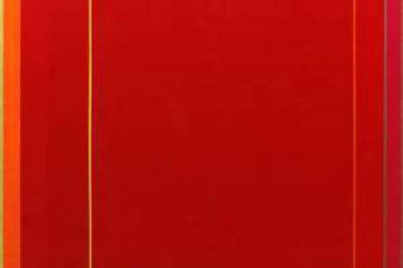
It is all part of his lifelong interest in colour theory: how colours work with and against each other, how they create feeling and emotion for the viewer. In his show at the Dubai Community Theatre and Arts Centre (DUCTAC), entitled All But Less Than, dense colour fields of sky blue, thick burgundy and tomato red are set against each other, square within square, and broken by strategically placed thin lines of contrasting hues within the frame.
The eye moves around the aqua flatness of a piece entitled Listening Blue, zigging and zagging back to the sides of the painting like a lie detector reacting to a tall tale on the paper below. Listening Blue's square of icy blue fizzes is marked out by tiny stripes of pale yellow, lavender, cerulean and bright orange at the edges of the painting. Those who have studied colour will understand Calver's work right away; blue and orange vibrate when placed next to each other since they are complementary colours, as are violet and yellow - all of which are used in Listening Blue. This vibration is what interests Calver. "You put two colours together and they heighten each other," says the artist by telephone from his atelier in Devon, England. "Colour is such a complex, intense thing, you have to plan it in some way."
And Calver does plan. He approaches the shades he uses methodically and meticulously, scientifically examining the colour he has chosen as the main theme - its temperature, its emotional evocations, and the strength of the pigment. Then he tries out different strips of artist's tape on top of it as a test run. He photographs his experiments to record which combinations he prefers, then, once this process has been completed, finally paints the actual stripes on the canvas. "I put the ground colour down first, then spend days, sometimes weeks, painting masking tape," he says. "Then I will correct it with a magnifying glass."
Calver does this to make sure there are no errant bits of paint to detract from the near-digital clarity of his work. Though graphic designers will love the work for its clean, sparse and intellectual comment on colour, what is in it for the rest of the art-loving public? Most of the excitement in Calver's work comes from the buzzing effect of those complementary shades (the blue-orange, yellow-purple and red-green combinations mentioned earlier). Unfortunately, though, the sheer flatness of the work can be a little off-putting.
After a while, the similarity in construction and the apparent absence of the human hand in these paintings becomes tedious and unengaging. In fact, it often seems that these works could be machine-made, generated by a room full of computers. Still, walking around the pure white, rectangular space at the Manu Chhabria Gallery at DUCTAC, it is fun to think of Calver's varied references. The square-within-a-square compositions of Josef Albers, the famous colour theorist and painter, are especially apparent. Meanwhile, Mark Rothko's late works for the Rothko Chapel in Houston, Texas, and their haunting variations on the colour black are echoed in pieces such as Opera's Bones - a work that contrasts a reddish black and bluish black against each other, along with Calver's signature coloured stripes down the sides of the canvas.
This is Calver's first exhibit in the UAE, though he is well known and widely exhibited in the UK. Born and raised in London, the 66-year-old artist has based his work and life in rural Devon. He also worked from many years as a teacher of art in the West Country. Retirement in 1995 afforded more time to focus on his own work and the following year saw Calver admitted to the Newlyn Society of Artists, an arts group that has been based in the south-west of Britain since the 1800s.
Since then, Calver's work has been rewarded and lauded. The artist even become the recipient of an award last year from the prestigious Pollock Krasner Foundation, the US-based grant foundation named after the American painting greats Jackson Pollock and his wife, Lee Krasner. The opening for Calver's show last month was well attended, and even on a random Wednesday afternoon several visitors could be seen wandering around the gallery and staring intently at the paintings. While in town for the opening, Calver also conducted lectures with groups from the Jumeirah English Speaking School about how he makes his work and his exploration of colour.
It seems that Calver is just as inspired by Dubai as Dubai is inspired by him. "The light there and its intensity is extraordinary," he says. "In England, when I came back, the colours seemed dull in comparison." Though straightforward juxtapositions of colour are Calver's main inspiration, he does apply a painstakingly technical approach to his art. This is not only evident in the long and detailed process of testing out different-coloured stripes, but also in the vast amount of time he spends observing and thinking about painting, and considering other painters' use of colour.
While Calver does admit his link to both Mondrian and Albers, viewers would be hard pressed to guess many of his other artistic inspirations. "I spend a lot of time looking at Old Masters, especially Nicolas Poussin because of the structure of his painting," he says. "Buildings are quite inspiring as well- take, for instance, the whiteness of the buildings in Dubai and the flat colours against the sky."
Most of the work exhibited in All But Less Than was made in the last three years, indicating a remarkably creative period, and despite taking a certain inspiration from Dubai Calver has already returned to work. At home in his studio in Devon, the artist is now picking ground colours for a new generation of works - the most important step in his painting, he says. Calver also notes that this is a near-continuous process and that, since colour combinations are infinite, each of his paintings leads directly to another.
"This exhibition is about a fascination with colour, with its fugitive and complex nature," he says in an artist's statement for the show. "I want to make colour earn its living."
All But Less Than by Michael Calver, DUCTAC, 2nd floor of the Mall of the Emirates Complex, Orange parking level, (04 341 4777). Until Dec 11. @email:www.ductac.org
swolff@thenational.ae